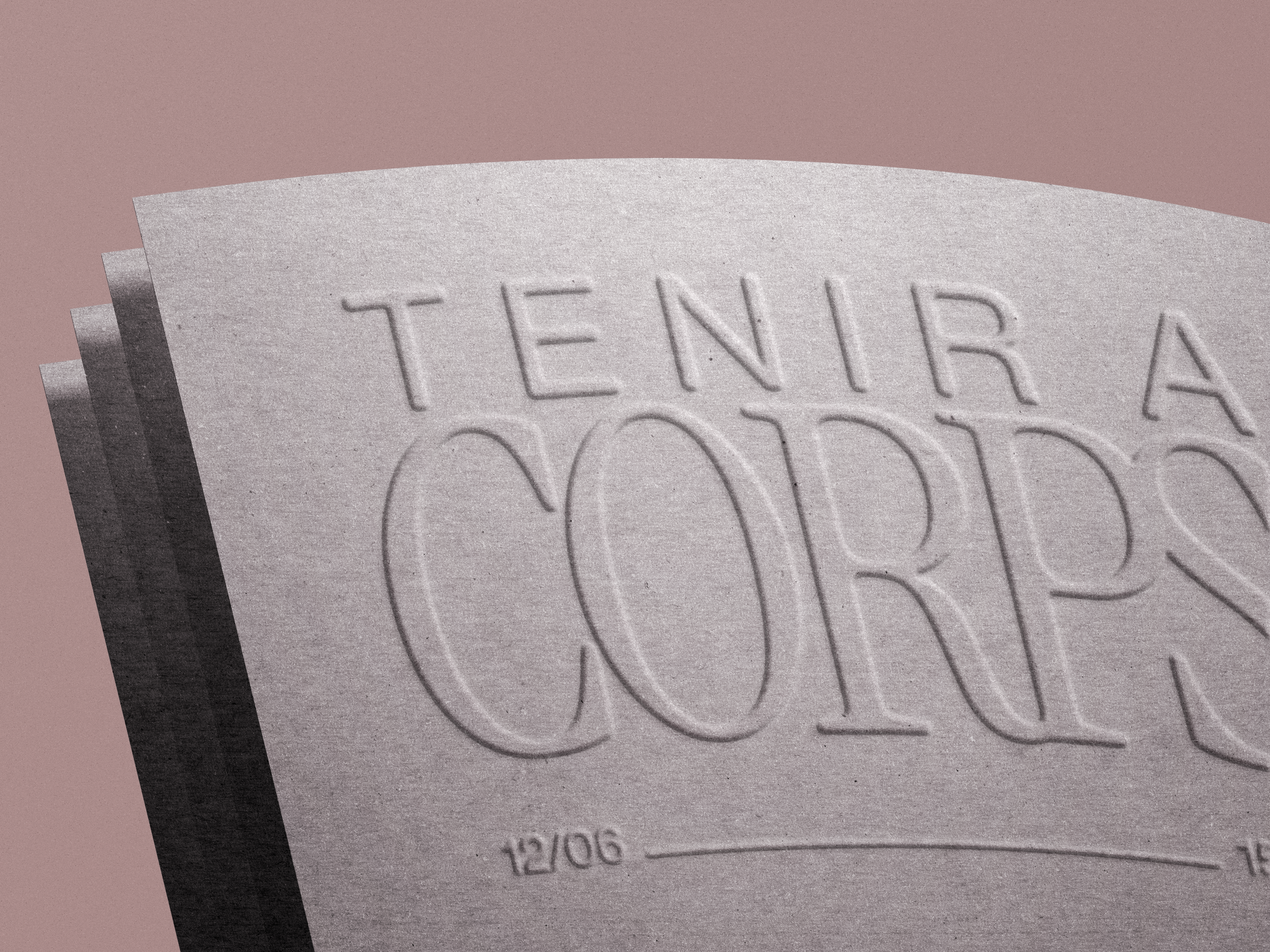
L’identité visuelle conçue pour René Berthoud s’inspire de la fluidité et de la transparence propres à l’aquarelle : une typographie élégante à empattements, aux lignes aérées, reflète la finesse du geste pictural. La palette chromatique reprend les tons naturels dominants de son travail — ocres, verts adoucis, bleus grisés — pour évoquer la sérénité de ses toiles.
+ Identité visuelle
+ Site web
[2024]